
Roof renovation
Tiles, insulation and gutters from one hand - with a fixed price before the first ladder goes up.
The bones of a page - grids, cards, panels and the containers that hold content together.
The opening of a section: a hairline rule, a mark sitting on its left end, the title, and the line that says what follows. Everything starts at one edge - centred body copy moves its own left edge with every line break, so the eye has to find the start of each line instead of jumping to a fixed position. Fine for a heading, tiring from the third line on.
The raw material - type, color, spacing and the small utilities everything else is built from. The lead stops at 65 characters, or at four fifths of the container, whichever comes first.
The content of the section starts here.
mw-section-head-numbered counts in the browser, so no page
keeps its own running order in the markup. The number closes the rule the
mark opens, and the counter restarts per mw-main. Opt-in: a
single section on a legal page numbered "01" is noise.
A section head without a lead works the same way - the next one below shows it, and takes a smaller gap to the content for it.
The mark is the one colored thing in the head, so it is where a section
picks up a tone: mw-section-head-secondary,
-success, -warning, -danger and
-info. Its length is
--mw-section-head-mark-width (80px), the gap to the content
below --mw-section-head-gap. That gap and the space above the
title are multiples of --mw-section-head-step, which follows
--mw-section-padding-block - so the section spacing picker in
the palette panel moves the heads along with the page.
MaverickWave CSS framework provides a simple grid system that adapts to different screen sizes, making responsive layouts simple to implement. It also has an advanced grid system with custom column spans. Perfect for complex layouts that need different column widths. Automatically stacks to single column on mobile devices.
12-column grid with custom spans: 2 columns + 4 columns + 1 column
Various column combinations: 3 + 6 + 3 columns
Sidebar + content layout: 4 + 8 columns
Perfect for unknown number of items. Cards maintain minimum 300px width and automatically wrap to new rows. Great for product listings, galleries, or any dynamic content.
Tiles of different sizes on one row rhythm - the layout a services page or a
dashboard reaches for when a plain grid makes every item look equally
important. One column on a phone, two from sm, four from
lg. mw-bento-wide spans two columns,
-tall two rows, -lg both and -full the
whole row. Spans only start with the second column, so a phone gets a plain
stack at content height. The grid packs dense, which can move a later tile
into an earlier gap - keep the tile order the reading order.
Tiles, insulation and gutters from one hand - with a fixed price before the first ladder goes up.
Mounting, wiring and the paperwork.
Storm damage fixed within 48 hours.
Cleaning plans twice a year.
Since 1998
Three generations on the roofs of the region - every job done by our own team, never subcontracted.
30 km around the workshop.
mw-bento-compact drops the row rhythm to 7rem for a row of
figures. Any other height goes into --mw-bento-row, on the grid
or on anything above it.
Revenue
48,210 EUR
Active users
1,284
Churn
2.1%
Open tickets
17
Uptime
99.98%
Plan
Business
The frame of an application rather than a page: a sidebar beside a column that
scrolls on its own under a sticky top bar. From lg the sidebar is
docked and the toggle folds it to an icon rail with
mw-app-collapsed; below that it is a panel over the content,
opened with mw-app-sidebar-open. The framework script sets both
from a button carrying data-mw-app-toggle - an Angular app can
bind the two classes itself.
mw-app-aside is the third column for an inspector, an assistant
or a game's inventory: docked beside the content from xl, a panel
over it below, toggled by data-mw-app-aside-toggle. On a phone
mw-app-tabbar takes the main destinations to the bottom edge.
data-mw-app-persist="name" remembers the rail and the docked
aside across reloads - try it here.
Active projects
12
Open tasks
48
Team members
7
The column scrolls on its own and the top bar stays - the page around
an app never moves, which is why the shell takes the height of the
screen through --mw-app-height (set to 34rem here).
Fold the sidebar with the button in the top bar. In the rail the
labels stay in the markup for a screen reader and
data-tooltip on each link names it under the pointer,
beside the icon with mw-tooltip-inline-end. A browser
without anchor positioning shows none there, since the rail would cut
it off.
On a phone the same toggle slides the sidebar in over a scrim. A tap on the scrim, Escape or a link closes it again, and the content behind it is inert while it is open.
<div class="mw-app" data-mw-app-persist="crm">
<aside class="mw-app-sidebar" id="nav">
<a class="mw-app-brand" href="/"><img src="logo.svg" alt="" /><span class="mw-app-label">Acme</span></a>
<nav class="mw-app-nav">
<p class="mw-app-nav-title">Workspace</p>
<a class="mw-app-nav-link mw-tooltip-inline-end" href="/" aria-current="page" data-tooltip="Dashboard">
<i class="fas fa-gauge"></i><span class="mw-app-label">Dashboard</span>
</a>
</nav>
<div class="mw-app-sidebar-footer">...</div>
</aside>
<div class="mw-app-main">
<header class="mw-app-topbar">
<button class="mw-app-toggle" data-mw-app-toggle aria-controls="nav" aria-label="Navigation">
<span class="mw-app-toggle-icon"></span>
</button>
<h1 class="mw-app-title">Dashboard</h1>
<div class="mw-app-actions">...</div>
</header>
<main class="mw-app-content">...</main>
</div>
<aside class="mw-app-aside" id="details">
<div class="mw-app-aside-header"><h2>Details</h2><button class="mw-app-toggle" data-mw-app-aside-toggle aria-label="Close">✕</button></div>
<div class="mw-app-aside-body">...</div>
</aside>
<nav class="mw-app-tabbar" aria-label="Primary">
<a class="mw-app-tabbar-item" href="/" aria-current="page"><i class="fas fa-gauge"></i><span class="mw-app-label">Dashboard</span></a>
</nav>
</div>
Tune it through --mw-app-sidebar-width,
--mw-app-rail-width, --mw-app-aside-width,
--mw-app-topbar-height and --mw-app-gutter on
.mw-app. mw-app-content-flush on the content hands
a canvas or a game board the whole column, without gutter and scroll.
The framework's main container: a surface, padding, an optional image, a
header and a footer. The add-ons - badge, ribbon, title icon - all take their
colour from one mw-card-addon-* class on the card itself.

This is the subtitle of this card in secondary text color
Cards are versatile containers for displaying related content and actions. This example shows an image card with a title and descriptive text.
A simple card without an image works well for text-focused content. Use cards to organize information into digestible sections with clear visual hierarchy.
Cards can include various components like tags to categorize content. This example shows how to display technologies used in a project.
Put a round icon badge in front of the card title. The icon uses the primary color out of the box.
Add an addon class to the card and the icon changes color with it - the same switch that drives badge and ribbon.
A title that needs more than one line keeps wrapping, the icon stays at its size and sits centered next to the text block.
 A logo instead of an icon
The same slot takes an <img> - a product logo, a
portrait. Add mw-card-title-icon-lg there: a wordmark
inside the default 38px is a smudge.
Building responsive, accessible, and performant user interfaces
Developing scalable APIs and server-side applications
Managing structured and unstructured data with the right tools
Automating deployment and scaling applications in the cloud
Ensuring code quality and reliability through automated testing
If you have a image and want to display the entire image, replace the standard
mw-card-img class with mw-card-img-contain in your
card markup. This alternative style ensures the complete image is visible
while maintaining centering and proportions. (See the first large and the
second extra large card)
Besides mw-card-lg and mw-card-xl you can set any
image height yourself with the --mw-card-img-height custom
property on the card.

Large cards feature taller images (340px height) that work well for portrait-oriented photos or when you want to showcase more of your visual content.

Large cards are perfect for team profiles, product features, or any content where the image deserves more prominence in your layout.
Here you can see the difference in portrait images between the standard
mw-card-img class on the first image and
mw-card-img-contain class on the second image.

This is the subtitle of this card in secondary text color
Extra large cards with 480px image height are ideal for portrait photography, profile spotlights, or when the visual element is the primary focus of your content.

The extra large card format creates a dramatic visual impact, making it perfect for highlighting key people, products, or artistic content in your application.
mw-actions-note puts one right-aligned, muted line above a row of
actions - what the buttons apply to, why one of them is disabled, or that
something cannot be taken back. It goes straight into the action row and needs
no wrapper: the line takes the full width and pushes the buttons below it. It
works the same way in mw-card-footer,
mw-modal-footer, mw-form-actions and
mw-panel-footer.
The plan stays active until the end of the current billing period.
Every invoice of the selected period, as one ZIP archive.
Tags can be used to categorize content or show related topics.
Nadia Kern
Product Designer
Cards can include avatars to represent users or team members.
Include progress bars to show completion status or metrics.
You can also use badges or ribbons on top of a card, or wrap the one card that should stand out in a feature frame.
The one we spent two years on. It is finally ready.
Meet our star contributor of the month and learn their tips.

Enjoy up to 50% off on selected items while stocks last.
Only a few spots remain. Secure yours before it’s gone!
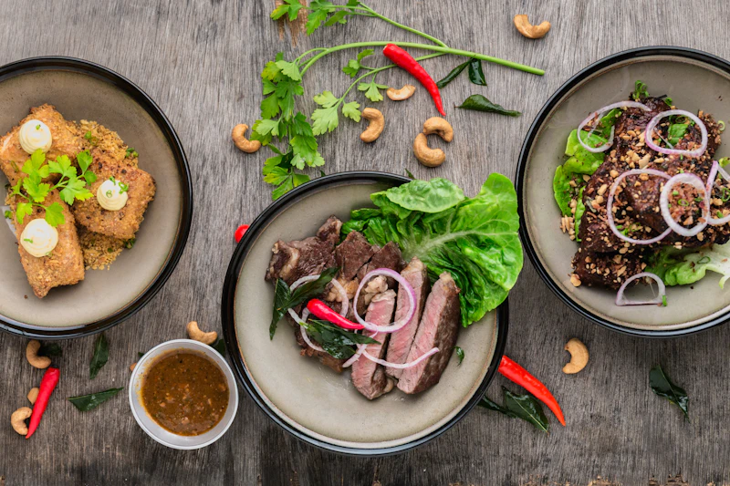
Our top pick selected by experts for quality and design.
A minor update will be rolled out tonight to improve performance.

Try out our redesigned dashboard and send us your feedback.
Invitation-only preview of our upcoming premium features.
The basics to get going, billed monthly.
Most booked
Everything from Starter plus the features most people ask for.
The full set, with priority support on top.
The frame is primary by default, secondary and info are one class away.
Primary
The one most people end up picking.
Secondary
Seats for everyone, billed per head.
Info
Free for 30 days, no card needed.
A card whose header and footer are part of the frame rather than the content.
mw-panel-primary and mw-panel-secondary fill the
header. The body scrolls on its own, which is what the max-height variants are
for: mw-panel-max-height-sm, -md and
-lg cap the panel at 300, 500 and 700px.
mw-panel-scrollable is the older name for md.
This is a panel with header, body, and footer sections. Panels are useful for grouping related content, including forms, tables, or other components.
The body scrolls once the content outgrows the cap. Header and footer stay where they are.
Lorem ipsum dolor sit amet, consectetur adipiscing elit. Nullam in dui mauris.
Vivamus hendrerit arcu sed erat molestie vehicula. Sed auctor neque eu tellus.
Vestibulum ante ipsum primis in faucibus orci luctus et ultrices posuere cubilia Curae.
Pellentesque habitant morbi tristique senectus et netus et malesuada fames ac turpis egestas.
Ut aliquam sollicitudin iaculis. Praesent ac semper ante. Interdum et malesuada fames ac ante ipsum primis in faucibus.
Mauris egestas elit vel nunc maximus, in aliquam magna vehicula. Cras vitae sapien a erat facilisis faucibus.
Donec dignissim, odio ac imperdiet luctus, elit lorem eleifend massa, sed efficitur turpis velit vel odio.
Suspendisse potenti. Nullam gravida fermentum turpis eu ultrices. Curabitur imperdiet imperdiet lacus.
Praesent ac semper ante. Interdum et malesuada fames ac ante ipsum primis in faucibus.
A head with a subtitle and several actions:
mw-panel-heading holds mw-panel-title and
mw-panel-subtitle, mw-panel-actions the buttons.
mw-panel-edge-* marks the one panel in a row that needs
attention, and a compact item list in the body drops its own box.
3 overdue · 1,240 EUR in total
All sites deployed
Nothing waiting - the last build ran two hours ago.
A tab bar scrolls sideways when it runs out of room, and now it says so: a
shadow appears on whichever side still has tabs behind it, and disappears once
that end is reached. Four gradients, no scroll listener. The fade colour comes
from --mw-scroll-hint-cover and follows the surface - inside a
card it fades into the card, on the page into the page. Seven tabs on a phone
used to mean the seventh was simply never found.
What you get once the two files are on the page:
MaverickWave CSS framework is built with modern web standards in mind:
"Dropped it into a side project on a Sunday. The grid and the form controls were the parts I did not have to touch afterwards."
"One variable for the brand colour and the whole palette followed. The dark theme needed no work from my side at all."
Where to look when something does not work:
Begin by creating a new project folder:
Add the CSS to your HTML:
<link rel="stylesheet"
href="path/maverick-wave.min.css">MaverickWave offers flexibility in how you configure and customize its appearance. The primary methods involve overriding CSS variables or, for deeper integration, overriding Sass variables during a build process.
If using the SCSS source files, you can control the theme output by
setting the $mw-theme-mode variable before importing the
framework:
'switchable' (Default): Includes dark and light themes,
controlled by JS.
'dark': Compiles only dark theme styles.'light': Compiles only light theme styles.// Your styles.scss
@use 'path/to/maverick-wave/src/scss/main' with (
$mw-theme-mode: 'switchable' // Or 'dark', 'light'
);Note: The main header/navigation currently retains its default dark appearance regardless of this setting.
See the "Customization" tab for details on overriding colors and fonts using either CSS or SCSS variables.
Choose the customization method that best suits your project setup:
Ideal for CDN/pre-compiled CSS usage. Define overrides in your own CSS file (loaded after MaverickWave):
/* your-custom-styles.css */
:root {
  --mw-primary-color: #0f766e;
  --mw-dark-page-background: #172127;
  --mw-font-family-base: 'Your Custom Font', sans-serif;
  /* ... other overrides ... */
}
Requires a Sass build process. Pass the overrides through
@use ... with (...):
// your-styles.scss
@use 'path/to/maverick-wave/src/scss/main' with (
  $primary-color: #0f766e,
  $secondary-color: #b45309
  // ... other root colors ...
);
Both methods end up at the same place: the derived tones (hover
colors, translucent backgrounds, borders, the ink variant the dark
theme needs) are calculated at runtime with color-mix()
and relative color syntax, so a single root color is enough.
Remember to load custom fonts using @font-face rules in
your CSS/SCSS before assigning them to
--mw-font-family-base (and
--mw-font-family-heading /
--mw-font-family-mono). The framework bundles no font and
falls back to a system stack.
Refer to the "Get Started" section for more detailed examples.
When working with MaverickWave:
Welcome to your dashboard! Here you can monitor key metrics, recent activity, and important notifications at a glance.
Manage your profile information, update your avatar, and customize your bio and contact details.
View and respond to messages from your team members. Organize conversations and track important communications.
Configure your account preferences, notification settings, privacy options, and security features.
Only as much content open as anyone needs at once. The header is the control and the panel follows it in the DOM, which is what lets the whole thing run off two state classes and no wrapper element.
MaverickWave is a lightweight, responsive CSS framework designed for modern web development. It provides a clean foundation with customizable components and utility classes to help you build beautiful, responsive websites quickly.
MaverickWave offers two main ways to customize its appearance to match your project's needs:
If you're using the pre-compiled CSS file (via CDN or download), you can override MaverickWave's default styles by redefining its CSS variables in your own stylesheet (loaded *after* MaverickWave's CSS).
/* Your custom-styles.css */
  :root {
    /* Root colors - hover tones, translucent backgrounds and borders
       are derived from them at runtime via color-mix() */
    --mw-primary-color: #0f766e;
    --mw-secondary-color: #b45309;

    /* Theme colors - card, footer and border are derived from these */
    --mw-dark-page-background: #172127;
    --mw-light-page-background: #f2f6f7;

    /* Font */
    --mw-font-family-base: 'Your Custom Font', sans-serif;
  }
This method is flexible and doesn't require a Sass build process.
If you integrate MaverickWave's SCSS source files into your project,
pass your overrides through @use ... with (...). A plain
assignment before the @use has no effect - the root
colors are declared with !default, which only the
configuration reaches.
// Your styles.scss

  @use 'path/to/maverick-wave/src/scss/main' with (
    $primary-color: #0f766e,
    $mw-theme-mode: 'dark' // 'switchable' | 'dark' | 'light'
  );
This method requires you to have a Sass compiler set up in your
project. Single components can be imported instead of
main - see the "Get Started" section.
See the "Get Started" section for more detailed integration examples for both methods.
Yes, MaverickWave CSS framework is fully responsive and works on all devices. It uses a mobile-first approach with responsive breakpoints for different screen sizes, ensuring your website looks great on phones, tablets, laptops, and desktops.
This accordion panel demonstrates scrollable content when the content exceeds the available space. This is useful for displaying large amounts of information in a compact format.
Accordions are excellent UI components for FAQs, product details, or any content that benefits from progressive disclosure. They help reduce cognitive load by showing only the most relevant information at first.
When designing with accordions, consider these best practices:
MaverickWave accordions are designed with accessibility in mind, ensuring they work well with screen readers and keyboard navigation. The smooth animations provide visual feedback without being distracting.
You can customize the appearance of accordions using CSS variables to match your brand colors and design language. The component is built with flexibility in mind.
For more complex use cases, you can nest accordions or combine them with other components like tabs or cards to create rich, interactive interfaces that guide users through complex information hierarchies.
Questions and answers on native <details>: they open
without script, the browser's find-in-page reaches a closed answer, and
nothing caps a long one. open on an item shows it on arrival, a
shared name keeps one answer open at a time, and a link to an
item's id opens it.
No. Every item is a details element, so it opens and closes on its own and the animation is CSS. The script only opens an item that a link points at.
It grows to its full height. There is no inner scrollbar, so a long answer on a phone reads like the rest of the page.
Paragraphs keep a readable measure and hyphenate in the language of the page.
Yes - this link opens the last question on the right.
Items that share a name form a group, and the browser closes the open one when another opens.
On a busy page or a coloured section, where hairlines get lost. The plain list suits a calm page with a narrow column.
Find-in-page opens the item that holds the match, in every browser that ships the reveal for details.
Here you can create clickable tiles with header, information and a possible image.
Organize tasks and track project progress
Collaborate with team members efficiently
Real-time data visualization and insights
Track KPIs and performance metrics
24/7 help desk and ticket management
Live chat and knowledge base access
Secure file storage and version control
Easy sharing and collaboration tools
Automated invoicing and payment tracking
Financial reporting and tax preparation
Role-based access control and permissions
User authentication and security settings
REST API reference guide
Code examples and tutorials
Two-factor authentication
Security audit logs
Automated daily backups
One-click data restoration
Server uptime: 99.9%
Response time: 150ms
Connect third-party apps
Webhook configurations
iOS and Android apps
Offline sync capabilities
Video tutorials available
Certification programs
All systems operational
Last incident: None

Scalable cloud hosting with auto-scaling capabilities and 99.99% uptime guarantee
Global CDN distribution with edge servers in 25+ locations worldwide

Advanced data analytics with machine learning insights and predictive modeling
Custom dashboards with real-time data visualization and automated reporting

One platform for CRM, ERP and workflow automation
Custom integrations and dedicated support for enterprise-level requirements
A <dialog> carrying the same mw-modal classes.
Escape, the focus trap and the inert page behind it come from the element, the
page scroll lock from the stylesheet - only opening it needs a line of script.
mw-modal-drawer turns the same dialog into a full-height panel on
the right edge, with mw-modal-drawer-start on the left. The body
scrolls between a fixed header and footer, and on a phone it stays a side
panel instead of becoming a sheet. Opened with show() instead of
showModal() it sits beside the content and leaves the page usable
- a copilot or a detail view.
The plain ul and ol the framework styles, for prose.
Anything meant to be used rather than read - selectable rows, menus - belongs
in the item lists instead.
Rows that are meant to be used, not just read: selectable, clickable, with a sliding accent or a checkbox. For a plain bulleted list use the HTML lists above.
mw-item-list-scroll-sm, -lg and
-xl change the height. Any other height is a
style="max-height: 160px" on the list.
A label, its value, and a dotted line connecting the two - the row a menu, a table of contents and an invoice all draw. The line is generated by the row itself, so the markup is two spans.
Label and value is what <dl> is for, and since HTML 5.2 a
<div> may group a <dt> and its
<dd> inside one - so the semantic version costs no extra
element over the plain <p>. Put
mw-leader-row on that <div> and the two
classes on the <dt> and <dd>. Use it
where the pair is the content; where every row also carries a
description, a <p> stays simpler.
Flatbread soup 5.80
Beef broth with pancake strips and chives
Roast pork with dumpling and red cabbage 17.50
A long label wraps and the leader stays beside its last line
mw-leader-row-top keeps the value beside the
first line of a wrapping label instead of the last. On a menu
that is where the price belongs - next to the dish, not somewhere down
in its description.
Roast pork with dumpling and red cabbage 17.50
The same row as a <dl>: the group
<div> carries mw-leader-row, the
<dt> and <dd> carry the other two
classes. No extra element over the <p> version.
Introduction 7
Second movement 24
Appendix 128
Total 1 284.00
A second mw-leader-row-value needs no extra class - both
sit after the leader, and a mark in the leader's colour goes between
them so the pair does not read as one long range.
Wiener schnitzel with fries 11.50 15.90
A process with a known number of steps and a current one. Horizontal where there is width for it, vertical where the labels need the room.
Project Initialized
Repository created and base structure set up.
Dependencies Installed
All npm packages resolved successfully.
Running Tests
Unit and integration tests in progress...
Deploy to Production
Awaiting test completion before release.
Two ways to play a picture against the scroll, both on the browser's scroll
timeline - no listener, and no
background-attachment: fixed, which iOS ignores. The image lives
in its own mw-parallax-media layer, as an
<img> or as a div with a background image. Where scroll
timelines are missing, or with prefers-reduced-motion, the
picture stands still and nothing else changes.
mw-parallax, the picture moves slower than the page
How far it travels is --mw-parallax-depth (10vh by
default); the layer overhangs the block by exactly that much, so no edge is
ever uncovered. mw-parallax-dimmed turns the picture down and the
text light.

The field moves slower than the page does.

mw-parallax-sticky, the picture stays and the page rides
over it
The home section of this page does it: the block pins itself to the top of the
screen and everything after it slides up over the picture. It goes on whatever
element the page content is a sibling of - the section around
a hero, not the hero itself - because that is what sticky and the sibling
selector need. Everything after it gets the page background and a layer above,
or the pinned picture shows through. The section right after it also gets an
upward shadow, so it reads as sliding over the picture rather than cutting it
off. That one carries fixed values instead of the elevation ramp: it lands on
the picture, not on a theme surface, and the light theme's shadows are cut for
paper and vanish there. Pair it with mw-header-reveal on the
header and the page opens on the picture alone: the bar stays away for the
first 130px of scroll and has ridden in by 420px. A control marked
mw-header-keep sits that ride out - it travels the bar's distance
the other way and waits at the position it will hold once the bar is there, so
a login button is on the picture from the first frame and nothing jumps at the
end. On a narrow screen it is how the burger reaches the reader before the bar
exists. While it floats it carries a ring and a soft shadow so a dark control
still reads on a dark picture, and focus leaves the bar alone - it is on
screen already, so a click on the theme toggle no longer hauls the header in.
Add mw-parallax-rise next to it and the picture lifts by
12vh while the text stays where it is - a pinned block does not
travel through the viewport, so that layer runs on the document's own scroll
instead, over the first screen of it. That makes it a hero move: further down
the page those pixels are long gone and the picture holds still.
--mw-parallax-depth is the dial, here as everywhere. Several
pinned blocks on one page are fine, each takes over from the one before.
mw-parallax-slow, the block travels behind the page
The band before the components section on this page: it keeps its place in the
flow and moves at a fifth of your scrolling, so picture and text are still
going while the next section closes in from below. Pinning is the same move
with the tempo at zero.
--mw-parallax-slow-travel (45vh) is the dial and
reads against the block's own height - half the height is half speed, the full
height stands still. Going past it sends the block backwards. The dial belongs
on the element carrying the class, the height on the
mw-parallax block inside it: set on the inner block it never
reaches the animation and the tempo stays at the default.
mw-parallax-pattern, a second layer that makes the
movement visible
The travel is vertical, so only an edge across it - a rule, a grid, a hatch -
ever shows it. A gradient has none and slides without looking like it moves.
Add a second mw-parallax-media carrying
mw-parallax-pattern: it travels a third of the distance, and it
is the difference between the two layers that reads as depth. In a hero the
pattern comes from $mw-hero-pattern, the way the picture comes
from $mw-hero-image; anywhere else set
--mw-parallax-pattern-image on it.
Both layers move. Only the one with edges tells you so.
<header class="mw-header mw-header-reveal">
  ...
  <button class="mw-login-btn mw-header-keep">...</button>
  <button class="mw-menu-btn mw-header-keep">...</button>
</header>

<main class="mw-main">
  <section class="mw-section mw-parallax-sticky mw-parallax-rise">
    <div class="mw-container mw-parallax">
      <div class="mw-parallax-media"></div>
      <div class="mw-parallax-media mw-parallax-pattern"></div>
      <div class="mw-hero">...</div>
    </div>
  </section>

  <section class="mw-section">...</section>
</main>This band travels at a fifth of your scrolling. The components close in from below.
Two colors. Everything else - bar, ink, borders, tints - is derived from them at runtime.
Every switch is one class on <html> or one custom property - no build, no rebuild. The box at the bottom is what a project would carry, and it reads back: paste someone else's setup in to see it. The link does the same - Copy link hands someone this page exactly as it stands.
Shown in the preview
Surfaces, controls and type - the section at the bottom of this page.
Elsewhere on the page
The frame around it. Scroll to see these.

